September 2019 product update
Our product team took advantage of the calm of the summer to do a lot of work on the design and UX side of Kantree. Here’s the first batch of improvements, which should simplify your daily use of Kantree.
General design improvements
In the kanban mode, cards have a new default look that helps information stand out better. The top bar was also revised to make the action and selection buttons more visible.

In the timeline mode, it’s now possible to show or hide cards without dates. Part of the interface was also moved to the top bar, allowing for more space in the timeline.

Additionally, a lot of work was done to improve the interface of the general sidebar. More airy and with fewer buttons, it is now easier to navigate.
A new Options button, offering new ways to customize the kanban view
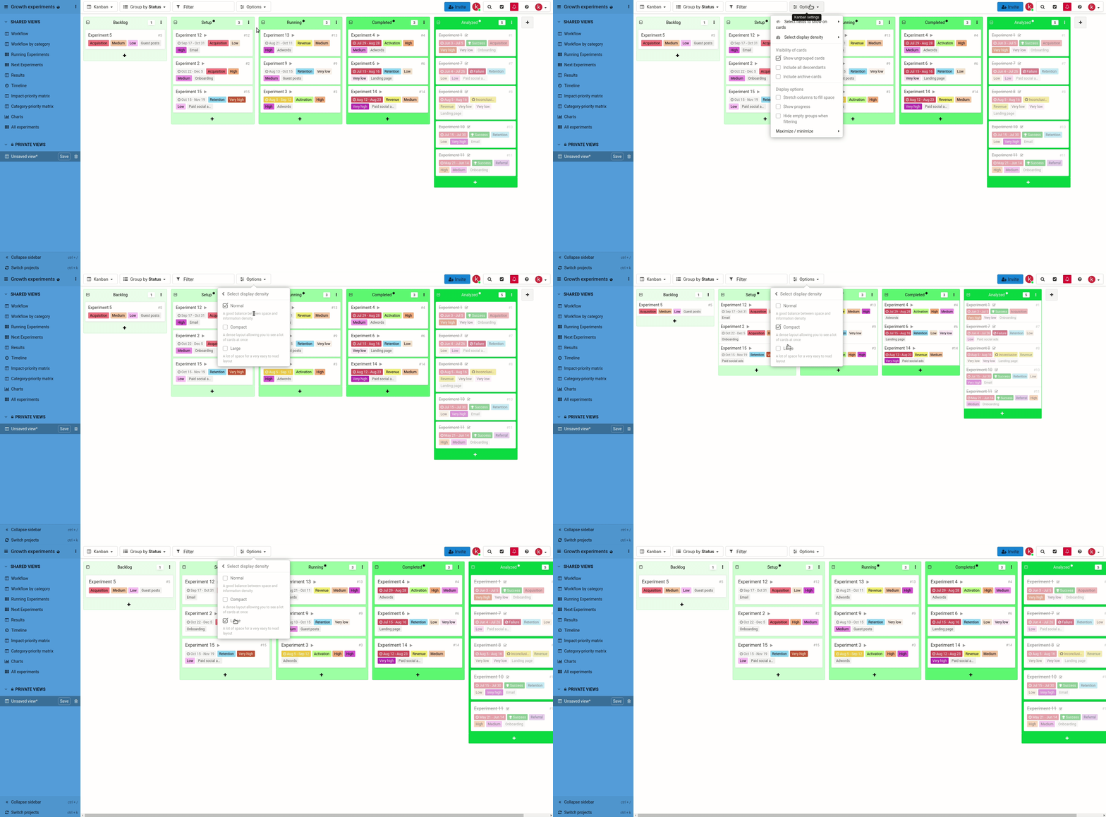
This new button combines previously available options with new customization possibilities. As a result, you can manage the level of information density (normal, compact, large) and tailor it to all situations.
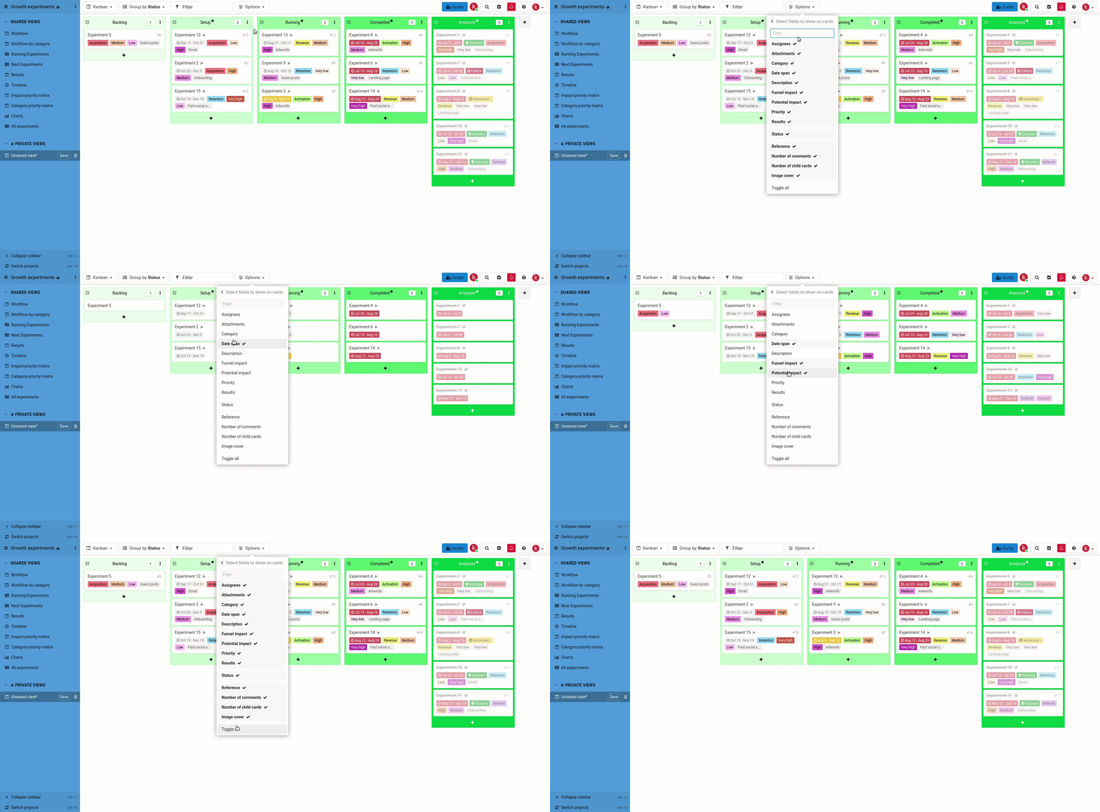
This feature is something that a lot of our customers were waiting for. In this new menu, you’ll find a selector of fields displayed on the cards. The order in which the fields are selected will be the same on cards.
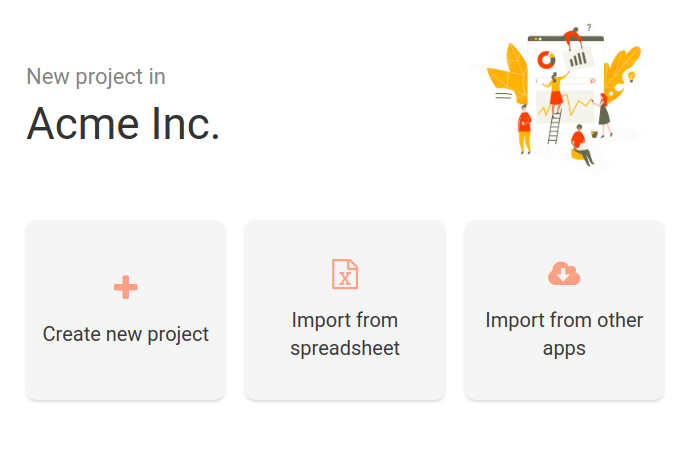
New project creation module, including a new template library
In conjunction with our work on the interface, we also redesigned the project creation module. It offers a better understanding of all available options without sacrificing general ergonomics.
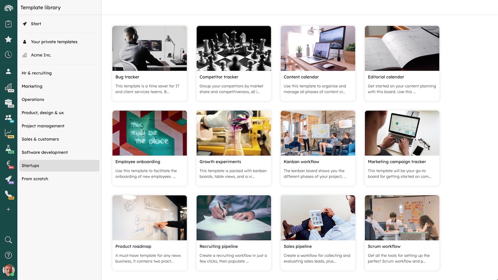
A library of 14 templates was also created to let you quickly start a project. We will update these projects regularly, so that you’ll always be able to take advantage of the latest Kantree features.
Other improvements worth mentioning
Here’s a brief summary of other new additions to Kantree:
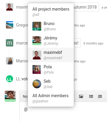
- In a comment, mention a role (e.g. @@Members) to notify all “Members” of the project
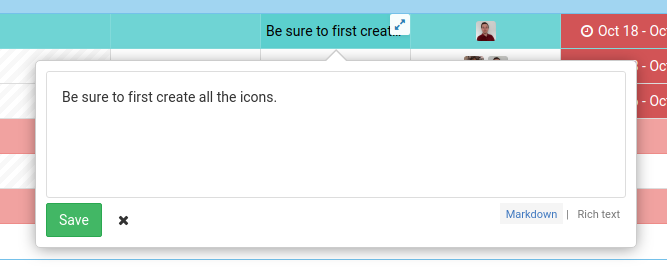
- “Text content” fields are now visible in the table view or in the logs.
- Querying sub-cards or the parent card displays new options in the “Formulas” field, “Report mode,” or ways to filter cards in a project.
- Updating existing cards by importing a spreadsheet allows you to make changes outside of Kantree before applying them to the project.
- When you’re inside a project, you can filter notifications to only display those associated with the project (useful for using Kantree in several tabs).
- From now on, weeks start on a Monday :)
_____
Follow our public roadmap and be a part of building Kantree! Members can submit ideas and comment on in-progress items. Questions? Send an email or tweet us at @kantreeapp.