In your project, you can create beautiful reports with charts and graphs.
These reports are very customizable and you can track many different aspects of your project.
Reporting tool
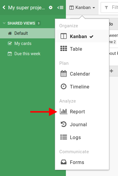
You can access the Report by clicking on the tool menu.
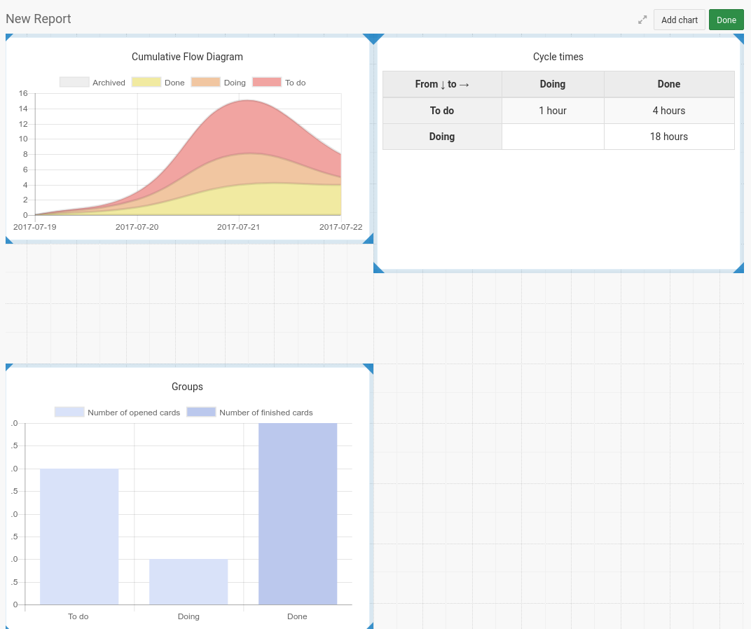
You will arrive on this page.
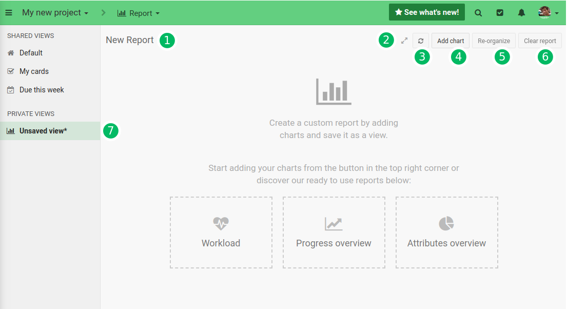
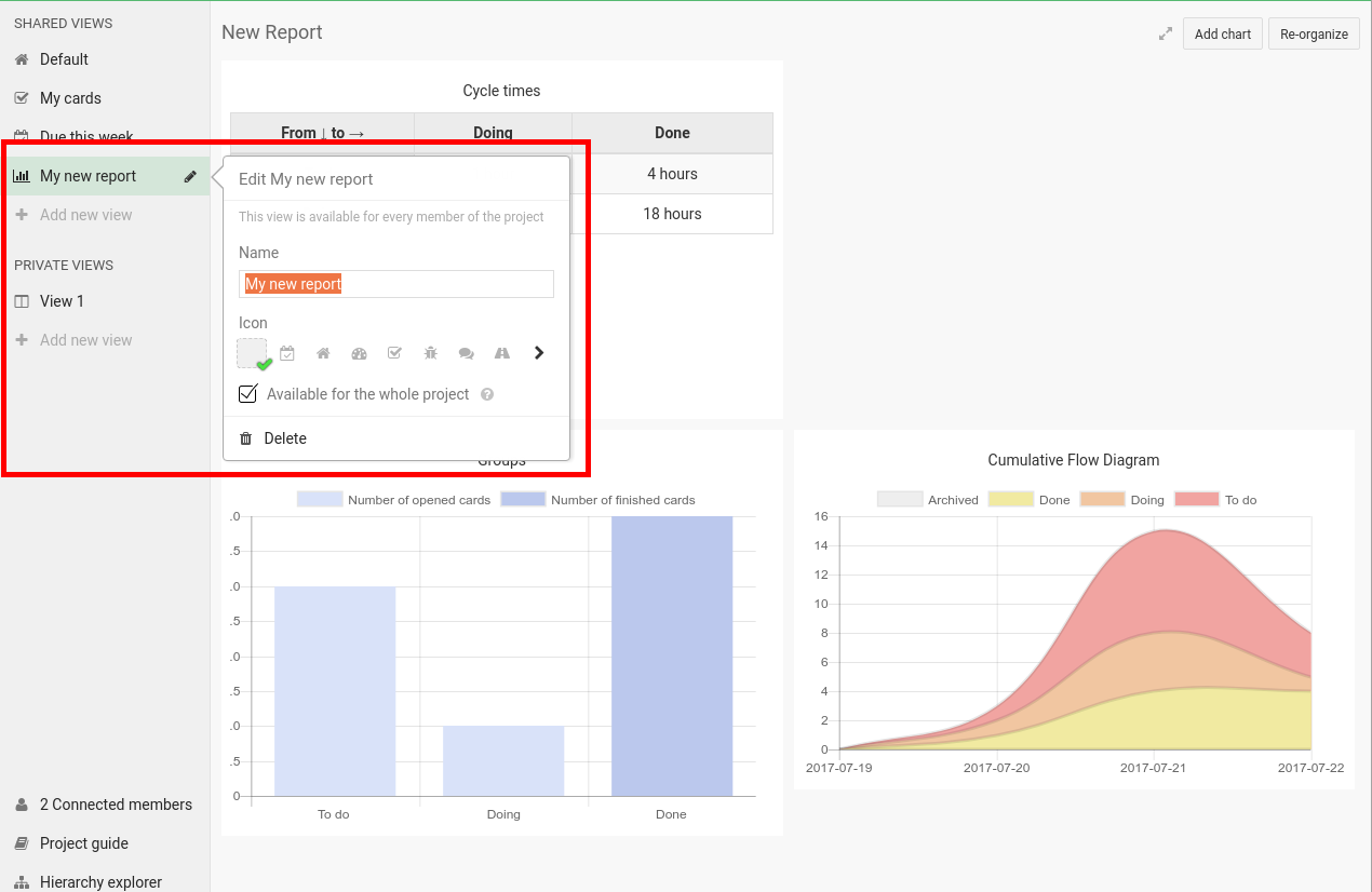
- Double-click to rename your report
- Enable full screen mode
- Refresh all your widgets and their data
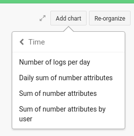
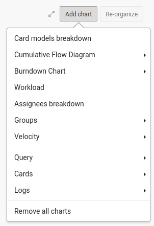
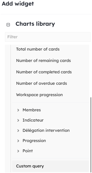
- Add [some charts](/help/guides/analytics#graphs-and-charts-overview). This will be like
widgetyou can rearrange on your page. - Enter the
re-organizemode, this will let you [reorganize your widget](/help/guides/analytics#reorganize-your-report) as you wish - Clear all your widgets.
- If you want to save your report don’t forget to create a new view, or to save it in an existing view
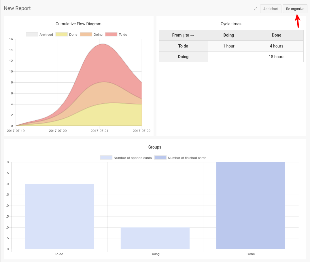
We provide a few builtin reports, that you can tweak as you wish.
Add graphs
Select a chart in the add chart menu.
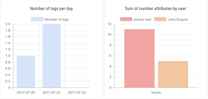
once selected one, a widget with a graph will appear.
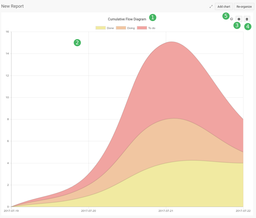
on hovering the widget, 3, 4, 5 will appear.
- This is the title of the widget,
double-clickto edit - This is the content of the widget, it will be updated each time you modify the settings (see
3) - Access to the settings of the widget. It will help you customize your widget (depending on the type of the widget, you may not have any settings available)
- You can remove the widget from your report
- Here on hover is a short description of the widget and how to use it (you will find the same as subtitle of the settings panel of the widget, see
3). You will find the last update date.
In any graphs in which choosing groups is possible, you can either select groups from contexts or fields.
Reorganize your report
Once you’ve add a few widget, you can click the re-organize button to enter in layout edit mode.
Once you clicked, blue borders appear on your widgets, with strong blue for their corners.
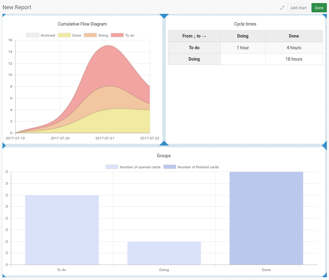
In this mode, widgets are not deletable or editable.
Click and drag the borders or corners to resize your widget.
When you have enough empty space in your report, you can drag and move your widget to change their position on the page.
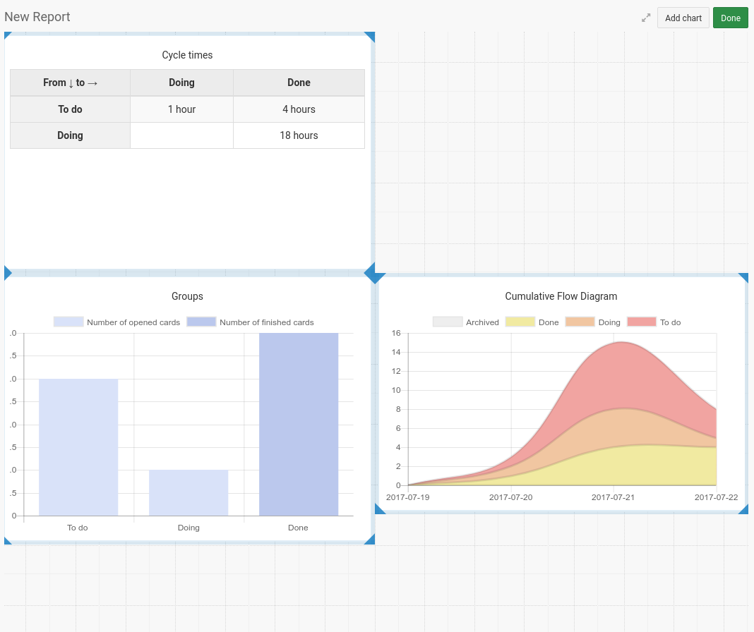
A grid in the background will help you out with the positioning and resizing of your widgets.
Save report
Once you’re satisfied with your report, you can save it as a view in your project
Graphs and charts overview
Here is an overview of all the available graphs and charts.
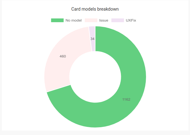
Card types breakdown
This simple pie chart represents the breakdown of cards of different types. Archive cards are included.
Cumulative Flow Diagram
This chart allows you to get a quick overview of what’s happening in a project. On the vertical axis you will find a number of cards while the horizontal axis represents time. The different curves represent the cumulative number of cards in each groupe as time flows.
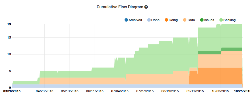
Reading the graph on the vertical axis will help you estimate the amount of work that was done/needs to be done.
This graph helps you identify bottleneck in your workflow.
In the options settings, you can decide to:
- change the groups used for the flow
- use a 30 days timespan, or since the beginning of the project
- display or not the archived cards
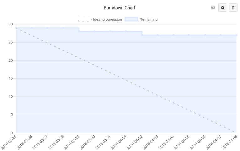
Burndown chart
Burndown chart is one of the main charts of the Scrum methodology, it will let you know exactly how much points of work needs to be done before the end of the current sprint. As the chart is drawn, it will automatically forecast a end date for your sprint, and you know then if you’re ahead of time or late in your current iteration.
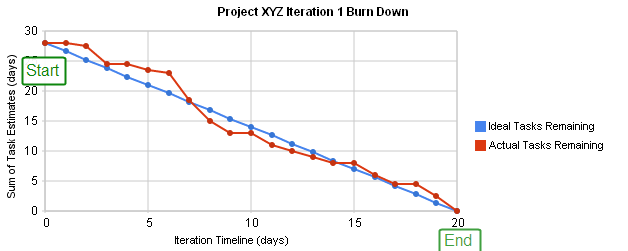
After selected a context which represent your sprint (or iteration), a first graph will be drawn.
In the settings you can select a [card field (type number or size)](/help/guides/customize-cards#card-fields-overview), which will serve as story points. If none is selected, 1 card equal 1 point. However you can select a default weighting for your card.
The duration of your sprint is set by [the start and end date you’ve given to your groups](/help/guides/organize-a-project#group-options).
By default it will take the current active sprint (the group with the start and end dates corresponding to today) but you can choose the one you prefer in the options.
Archived cards are not used in the construction of your burndown charts, be careful if you want to see the burndown of an old sprint.
Workload
The workload shows you how much cards are assigned to each members and a quick ideas of the state of the cards.
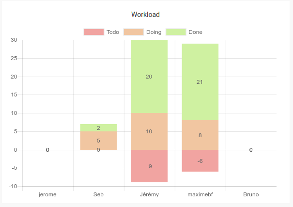
Under 0 is the number of cards waiting to be worked on.
Above is the number of cards which are currently worked on, or done.
Archived cards are not displayed.
You can ponderate your chart by a [card field (type number or size)](/help/guides/customize-cards#card-fields-overview).
If we talk about builtin card states, To do represents undecided et accepted states, Doing represents In progress and Waiting, Done represents completed and closed.
With this graph you can quickly rebalance work in the team.
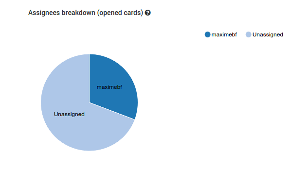
Assignees breakdown
This simple pie chart represents the breakdown between assignees to a card. It takes into account any field of type Member. Archive cards are not included.
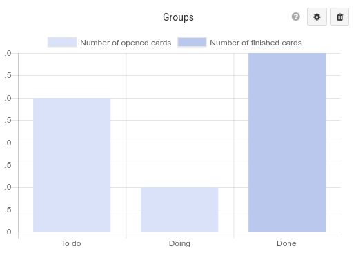
Groups
The groups graph shows the total number of cards in each of the group of the selected context.
Completed cards are represented by a darker color in the column.
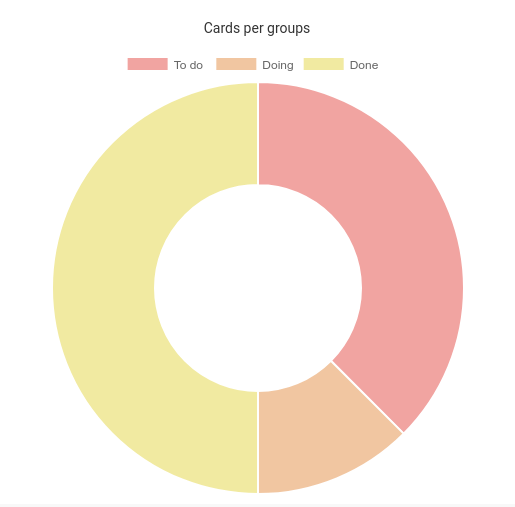
Card per groups
This pie chart shows the card per group of the selected context. It gives you a percentage instead of a precise value like the latter graph.
Time between groups (or cycle time)
Note: this chart assumes your kanban columns flow from left to right.
This table shows the amount of time it takes for cards to go from one group to another. It reads as: “Cards from groups on the vertical axis took on average X amount of time to go to groups on the horizontal axis”.
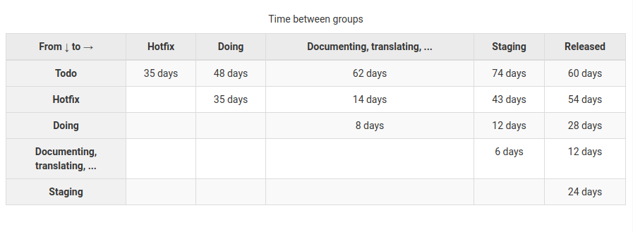
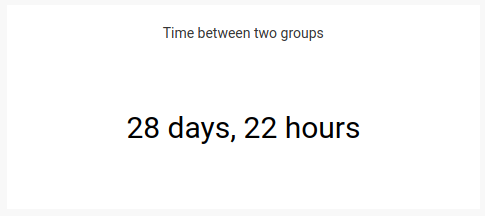
In this example, cards took in average 28 days to go from Doing to Released.
Each value from the table is independent from the others, it does not take into account the flow of your groups.
The options let you decide which group you want to use for your flow.
Time between two groups
This widget let you display the time card takes to go from group A to group B during a seleted time span (this week, last week, this month etc).
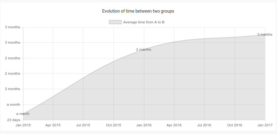
Evolution of time between two groups
This graph lets you display the changes through time of the time card takes to go from group A to group B.
Evolution of number of cards in group
This graph lets you display the changes through time of number of cards in a specific group
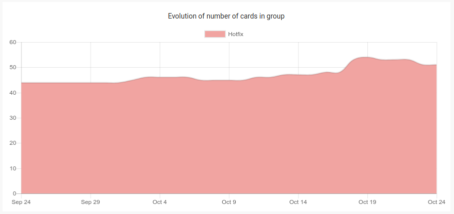
Here for example, you can see the changes in the number of cards in the group hotfix.
Weekly velocity
Weekly velocity graph shows you how much card you’ve done per week through time, and draw an average velocity per week line (in red).
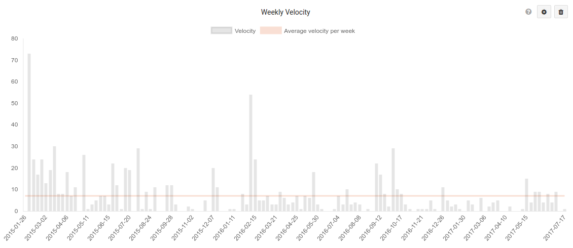
If you choose to ponderate your velocity by a [card field (type number or size)](/help/guides/customize-cards#card-fields-overview), it also draws a line for the number of finished card.
You can choose the period : last 30 days, last 10 weeks, all time.
You can choose to exclude archived cards.
Velocity per groups
Velocity per group graph shows your velocity (how much card done per week) per group of the [specified context and draw an average velocity per week line (in red).
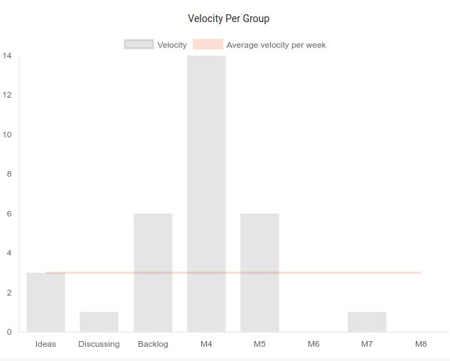
If you choose to ponderate your velocity by a [card field (type number or size)](/help/guides/customize-cards#card-fields-overview) , it also draws aline for the number of finished card.
You can choose to exclude archived cards.
Members velocity
Members velocity table show you velocity and stats for every member of your project.
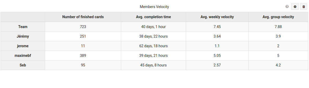
It gives you number of finished cards, average completion time, average weekly velocity, average group velocity.
You should select the [card field (type member)](/help/guides/customize-cards#card-fields-overview), which is considered as the assignee of the card.
You should select a context which will serve for the average group velocity calculation.
For example your Sprints.
You can choose to ponderate your velocity by a [card field (type number or size)](/help/guides/customize-cards#card-fields-overview). For example your Story points.
You can choose to exclude archived cards.
Custom query
To write a query, you must use the KQL language and add it in the “Query” field. Grouping and display options are available below this block.
For example, display the cards grouped by Assignment in a “Pie” diagram.
Click on a widget, and it will open a kanban with the corresponding filter.
You can choose to group the results of your queries by some groups or card fields and display them in graphs
For example, display cards grouped by assignees in a Pie chart.
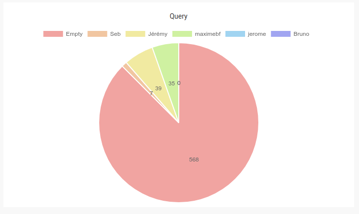
Choose between Table, Line, Bar, Pie and Radar graphes.
Define multiple queries one after another using ;. The results will be automatically displayed in a Table
For instance, query(@me, count()); query(not @me, count())
By default, your queries expression will be displayed in charts
However you can provide a label that will be displayed instead, using this syntax query as "label"
For instance, query(@me, count()) as "My cards"
When your search includes a filter and a calculation, you must use the function query()
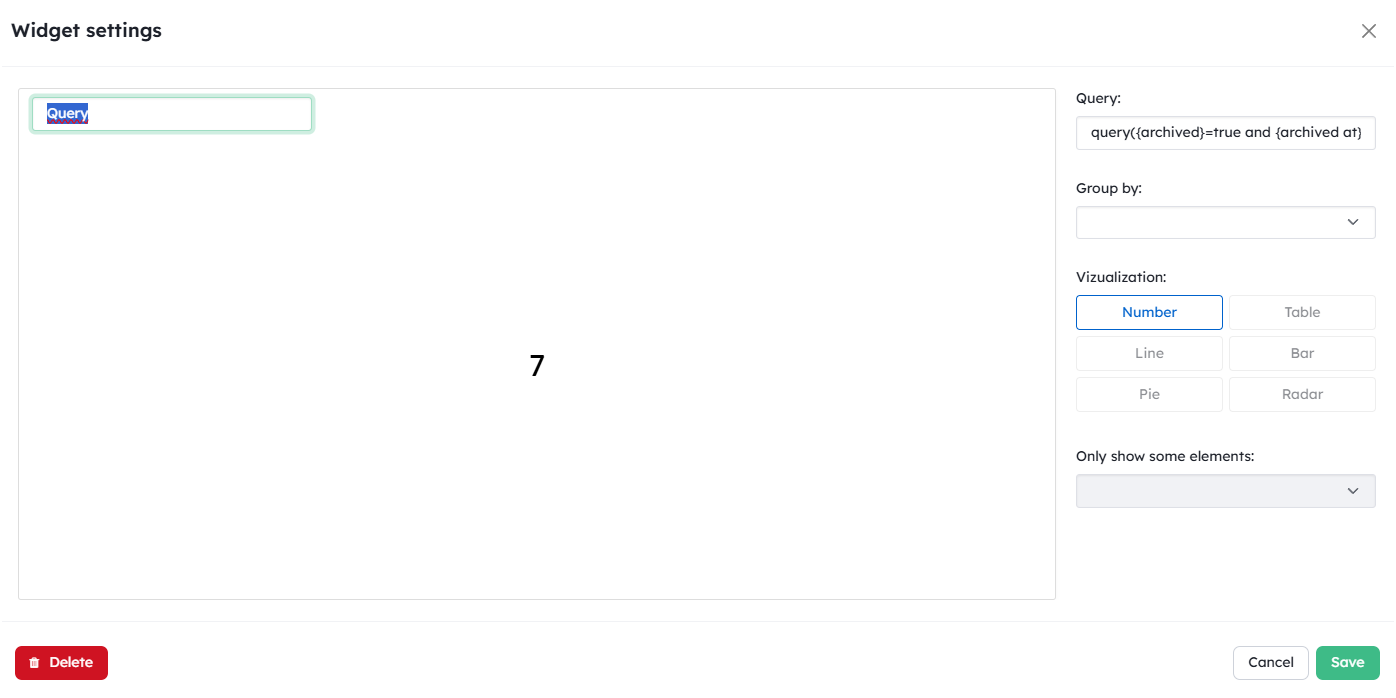
Example 1 - Calculate a sum on the archived cards based on a period
By default, archived cards are not taken into account in the calculation, which is why your expression must specify their status as archived. In this example, the {point} field contains the value that makes it possible to sum up all the cards that correspond to this filter.
query({archived}=true and {archived at}>=”2025-01-01”,sum({point}))
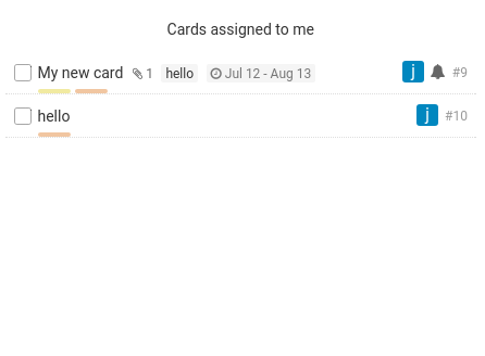
Cards lists
You can create card lists using Cards widgets.
Select your filters with the menu.
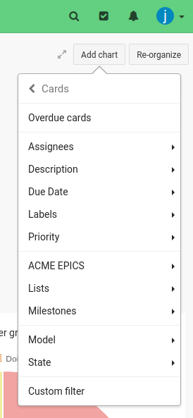
It display a list of cards matching the selected filter.
You can use the KQL language to create a custom query.
Logs
You can display stats about [the log of your project](/help/guides/logs).