Kanban swimlanes and more reporting tools
We are very pleased to introduce kanban swimlanes as part of this product release. We’ve also created a few more charts for your project reports. Let’s have a look.
Swimlanes: kanban gets an upgrade
This was a long-awaited feature since the beginning of Kantree.
What exactly are kanban board swimlanes? They are horizontal lines that divide your board into sections. By displaying two dimensions at once, they provide a visual separation of different work types and group related tasks together in one board. Because of that, swimlanes are very helpful in project management.
[Related reading: To do, doing, done: Introduction to kanban methodology]
- Teams can use them to get a better understanding of the workflow and cross team dependencies, spot any issues or bottlenecks early, and prioritize work accordingly.
- With swimlanes, it becomes easier to plan and run your kanban and sprints. They are also useful for sorting out your product backlog or project roadmap.
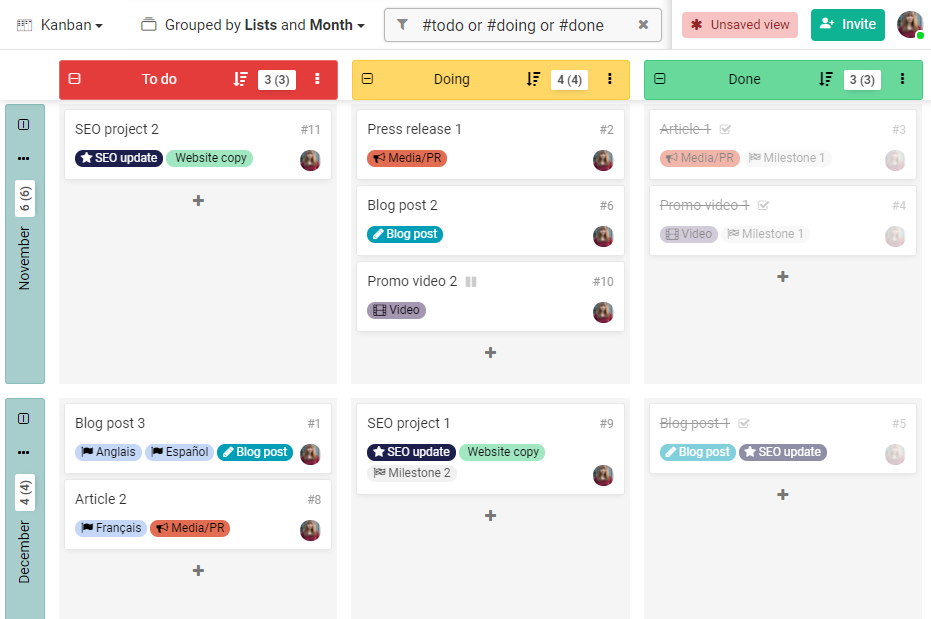 Kanban swimlanes divide your board into sections, displaying two dimensions at once.
How to display swimlanes in Kantree
You can select another dimension in the group by menu at the top of your board. In the pop-up window, you will be able to separate your cards by whatever groups or card attributes are present in your project (assignees, month, priority level etc.).
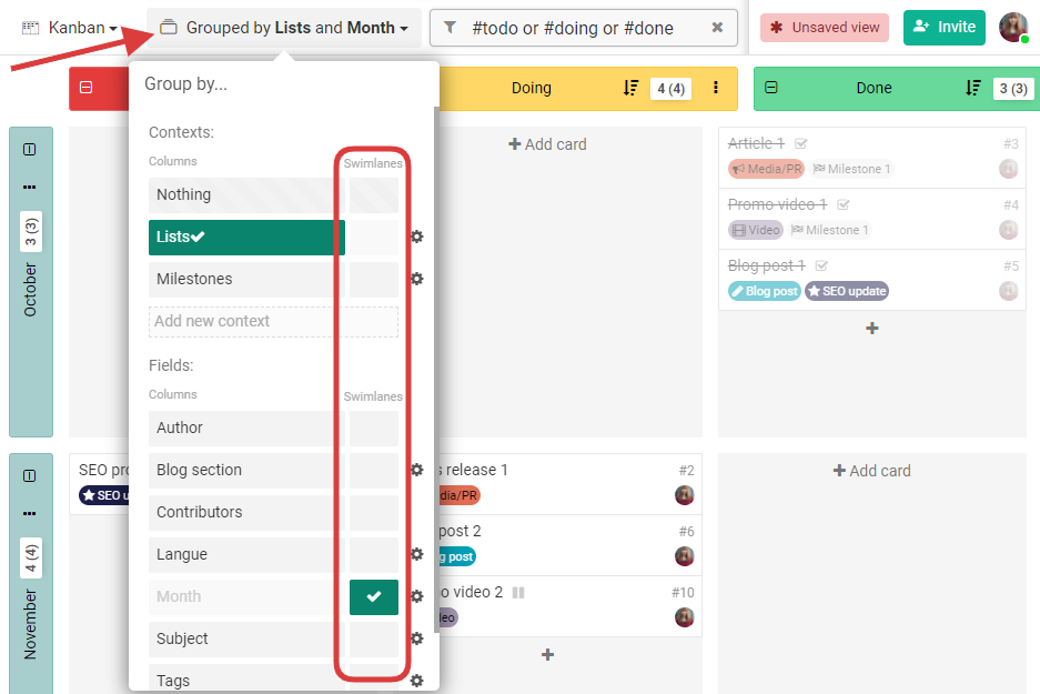 Create swimlanes from the “group by” menu at the top of your kanban board.
[Further reading: 3 tips for how to set up a kanban board]
New tools for reports
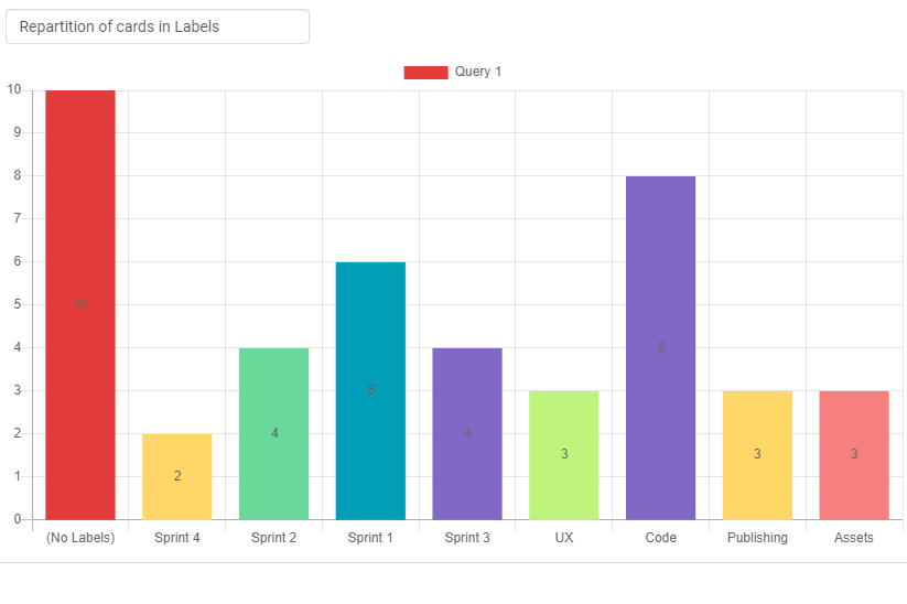
In reports (dashboard view), you can now create charts from specific requests, such as “I want to see the number of tasks processed today, grouped by type,” or “Show me a breakdown of the tasks in each sprint.”
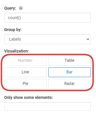
Kantree will generate various colorful diagrams, such as a bar chart like this one:
Or a pie chart, like this one below:
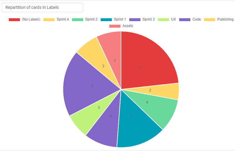
We hope these new charts will be your handy project management reporting tools, whenever you need a visual interpretation of the current progress of your project.
To create your perfect report, you will have to learn a few things about the Kantree Query Language, but we plan to release a simpler query builder in the future.
[Further reading: All about reporting in Kantree Help]
We can’t wait to see what you will do with these features, feel free to share your experience with us via email or on Twitter. As always, you will find the rest of the release notes here.